Ah, small bedrooms. You either love ’em or tolerate ’em. But here’s the thing: neutral colors can totally flip the vibe of a tiny space. I’m talking calm, stylish, breathable magic. Not boring beige. Not “rental cream”. We’re going for cozy sophistication without feeling like you’re squatting in a shoebox. When choosing Color Palettes for Small Bedrooms, the goal is to elevate the space with tones that make it feel open yet inviting.
So let’s go ahead and get into 16 genuinely awesome neutral color palettes that’ll make your small bedroom feel bigger, softer, and way more intentional. Like you actually meant it, even if you’re still using a foldable desk and your bed frame came from a sidewalk (no shame).
1. Greige + Dusty Rose + Cream
Greige—yep, that lovechild of gray and beige—is weirdly perfect. It’s got that muted warmth but doesn’t look like drywall. Toss in some dusty rose throw pillows and cream linens. Suddenly, the room feels romantic but not like it’s trying too hard.
Also, greige doesn’t argue with your plants or your hardwood floor. Bonus.
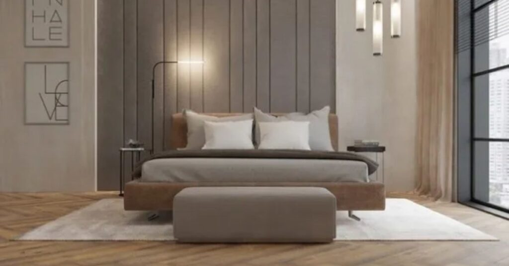
2. Soft Taupe + White + Caramel Leather
Taupe is the cousin of beige that’s lived abroad. Use it on walls or bedding, then hit it with crisp white accents—lamp shades, maybe a vintage nightstand you repainted last summer. Caramel leather adds that earthy pop that just pulls the whole thing together. Maybe a little ottoman or a headboard. Not a recliner. Please, no recliners in bedrooms.
3. Warm Ivory + Olive Green + Clay
Okay, this one’s a little earthy but still very neutral. Ivory walls are just… safe and clean. But throw in some olive green bedding or a handwoven wall hanging and you’re speaking fluent subtle style. Clay—a muted terracotta—makes a killer accent pillow or even a candle holder on the nightstand.
You want your room to whisper, not shout. This palette does that.
4. Light Gray + Muted Lilac + Matte Black
Gray is the backbone of modern neutrals, but it can get stale fast. Pair it with the softest, whisperiest lilac. Almost gray, but not quite. And then matte black for contrast—think curtain rods, frames, or a skinny floor lamp. Looks way more expensive than it is.
If your room’s got zero natural light, this combo still works. Promise.
5. Sandy Beige + Linen White + Worn Wood
This one’s got beachy vibes without the seashell decor. Beige and linen white are calming, no-fuss, and light-diffusing. Add some worn wood furniture—maybe that scuffed dresser you thrifted and never refinished. It adds story, y’know? Like, “I’ve lived a little.”
6. Creamy Oat + Stormy Gray + Navy
Oat is a bit like the color of almond milk if it was bougie. Super chill. Stormy gray keeps it grounded, and navy throws in some depth without getting all moody. Use navy sparingly—maybe a single piece of wall art or your bedspread. It’s all about balance. Too much navy in a small space and suddenly you’re in a submarine.
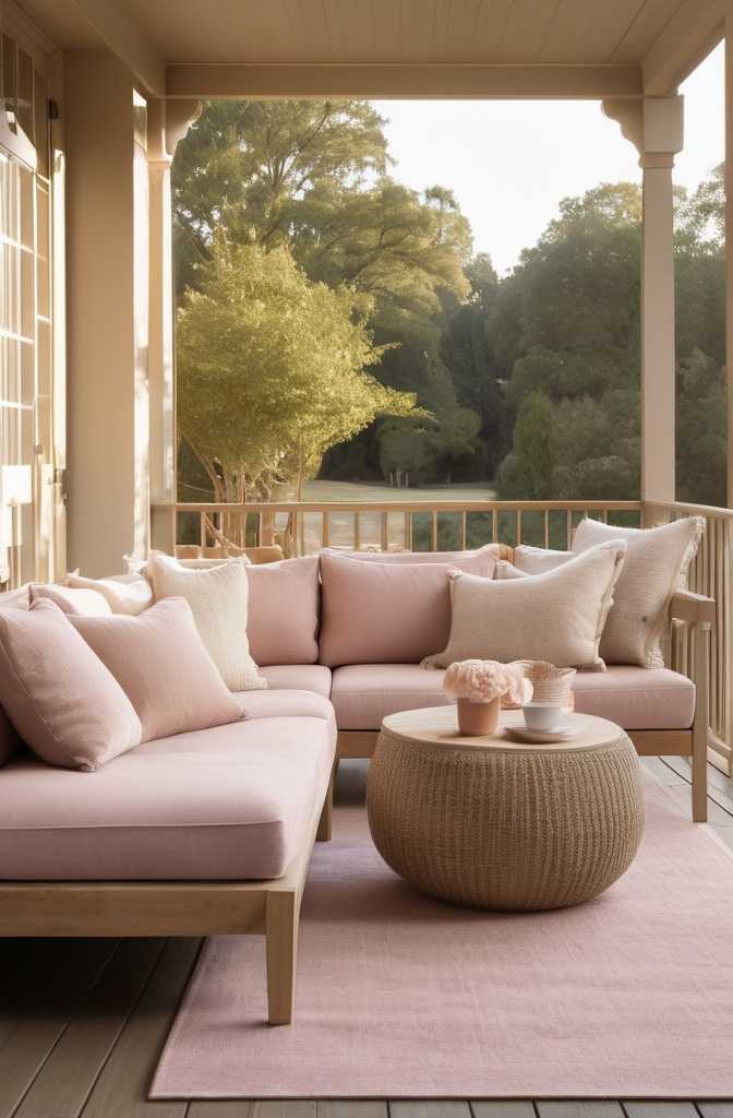
7. Blush Beige + Ecru + Brushed Gold
Blush beige has a gentle pink undertone that makes things feel soft and dreamy. Ecru, kind of like bone but not as stark, is perfect for your bigger items—sheets, curtains. Brushed gold hardware? Game changer. Switch out your drawer pulls or throw in a mirror with a thin gold frame.
Suddenly it’s giving Paris Airbnb.
8. Charcoal + Warm White + Dust
Charcoal is bold but neutral. It’s like that friend who’s quiet until they say something really smart. Accent wall? Maybe. Or just charcoal bedding. Pair it with warm white so it doesn’t get too cold-feeling. Add in dusty-colored decor—kind of muted, kind of smudgy. Dried flowers work. So does that old ceramic vase you weren’t sure about.
9. Mushroom + Vanilla + Slate
Mushroom is this moody, complex taupe that looks different depending on the light. It feels rich, like a truffle. Vanilla keeps it bright—like a candle that never got lit. Slate is a cool accent for your art or desk lamp. The combo feels quietly sophisticated. Like you read actual books in bed, not just scroll TikTok until 1 a.m. (same).
10. Pebble Gray + Sand + Pistachio
Now this one’s unexpected. Pebble gray is soft and kind of fuzzy-feeling in a good way. Sand adds warmth without being yellow. And pistachio? Hear me out. It’s just a tiny whisper of green. A blanket, maybe. Or a chair. It’s like your room knows about interior design trends, but doesn’t care too much.
11. Bone + Buttermilk + Rust
Bone is your base—very light, very flexible. Buttermilk adds a smidge of warmth and a hint of nostalgia, like a summer kitchen. Rust is your zinger. Use it with caution, but use it. A velvet pillow, a weird ceramic sculpture, something textured. Just enough to make people go, “Ooh, I like that.”
12. Pale Mocha + Cloud + Fig
Mocha, but light. Not coffee-shop brown, more like latte foam with a tan. Cloud is that soft, almost-white with a gray undertone. And fig is this deep, moody purple-brown. Almost black in low light. Perfect for a throw or an accent wall if you’re feeling bold. The vibe? Grown-up, but not uptight.
13. Frosted Almond + Dune + Ink
Frosted almond sounds like a lip gloss, but it’s actually a dreamy off-white with a creamy lean. Dune is soft beige with a whisper of pink. Then ink—pure, rich, near-black. You don’t need much of it. A line drawing, a tiny nightstand lamp. It creates contrast without making your room feel crowded.
14. Canvas + Camel + Moss
Canvas is that light natural tone that kinda resembles blank paper. It’s a blank-slate color. Camel adds that vintage leather look—try a throw, a pouf, whatever. And moss? Oof. So underrated. Put it in plants, art, or some abstract patterned bedding. It’s nature, but indoors and way cooler than fake ivy vines.
15. Pale Stone + Wheat + Coal
Pale stone is another gray-beige blend, but cooler-toned. Wheat adds light warmth, like fresh bread or… well, wheat. Coal is your grounding color—deep and chalky. Don’t overdo it. Maybe just in picture frames or bed legs. The whole combo feels like an indie film set in a minimalist cabin.
16. Snow + Soft Cement + Brass

Snow is crisp, soft white. Not blinding, not sterile. Cement is that pale, flat gray that works on walls or upholstery. Brass takes it somewhere more luxe. Swap out drawer knobs, get a small lamp, or find a little vintage mirror frame. The mix feels like Scandi elegance without the IKEA overload.